포옥 2022.11
Po.oak

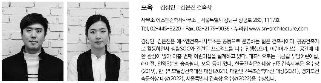
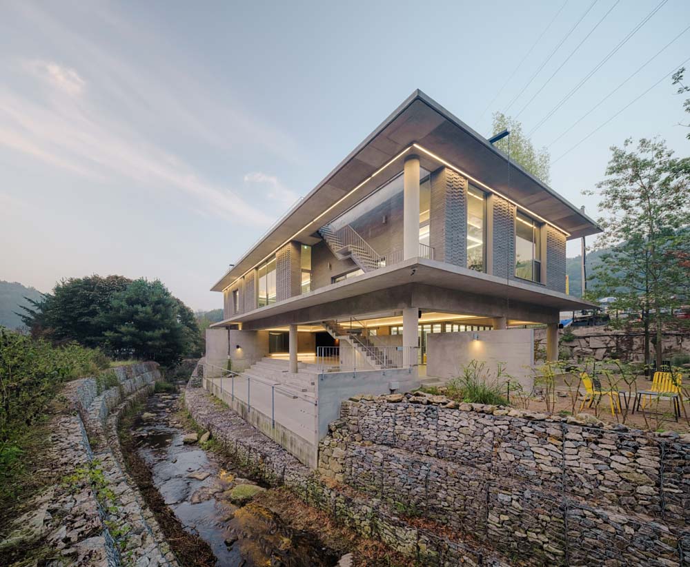
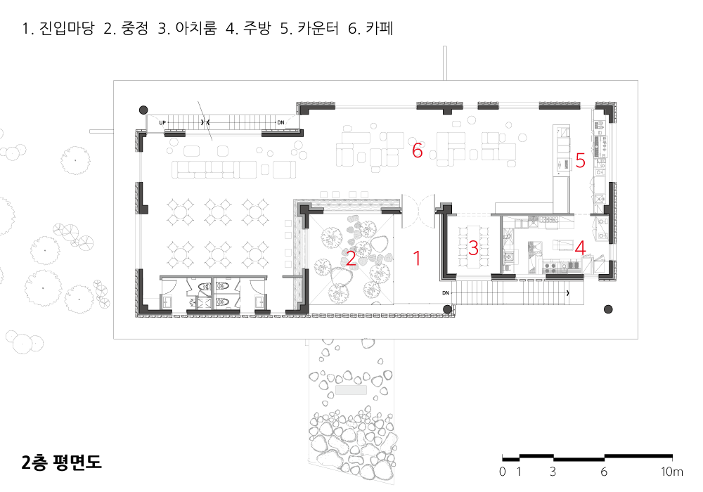
대지는 주변보다 3미터 정도 낮았으며, 무분별하게 들어선 식당들로 둘러싸여 인지성이 떨어진다. 유일하게 희망적인 요소는 대지의 동쪽에 실개천이 흐르고, 그 뒤로 산이 있다는 점이다. 비록 뒷산에 송전탑이 우뚝 서있고, 산의 일부가 개발업자에 의해 훼손되긴 했지만 말이다. 1층 필로티 공간에 들어서면, 구로강판으로 된 거대한 문이 중정의 모습 일부를 가리면서 틈 사이로 보여준다. 이 공간부터 정원까지를 ‘숨겨진 자연’이라고 표현하였다. 자작나무와 돌, 이끼로 구성된 중정은 빛과 그림자가 더해져 극적인 분위기를 연출한다. 사방이 노출콘크리트로 된 필로티 공간은 건조하고 삭막할 수 있으나, 적당히 가려져 틈새로 보이는 초록은 더욱 빛이 나고 이색적인 경험이다.
건축적 해법
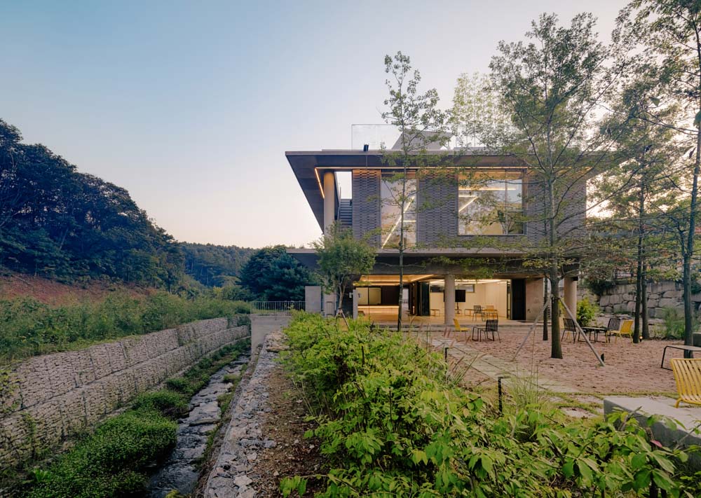
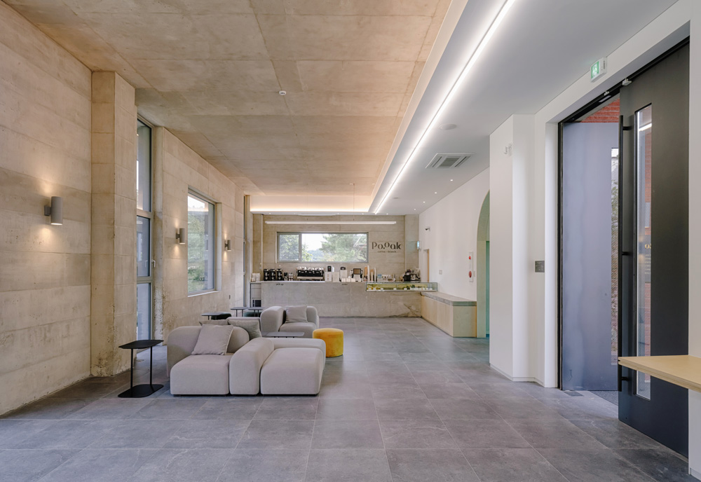
상업 건축, 특히 카페의 승패는 공간의 분위기에 있다. 건축적 해법으로 첫 번째, 카페를 들어올려 1층에 거대한 필로티 외부공간을 만들었다. 대지 내 정원과 연계되어 자연을 가까이서 즐길 수 있는 공간이다. 두 번째로는 가벽과 연장된 슬라브로 정돈되지 않은 풍경을 정리하였다. 가벽은 모든 것을 가리기보다는 적당히 가리고 열어줌으로써 뒤 공간에 대한 호기심을 유발하는 장치이다. 마지막으로, 배경이 되는 건축을 만들기 위해 가장 기본적이고 솔직한 재료인 콘크리트를 주마감재로 하였다. 노출콘크리트에 의해 적당히 가려진 초록도 무미건조한 물성 사이에서 빛이 난다.
떠있는 수평의 띠
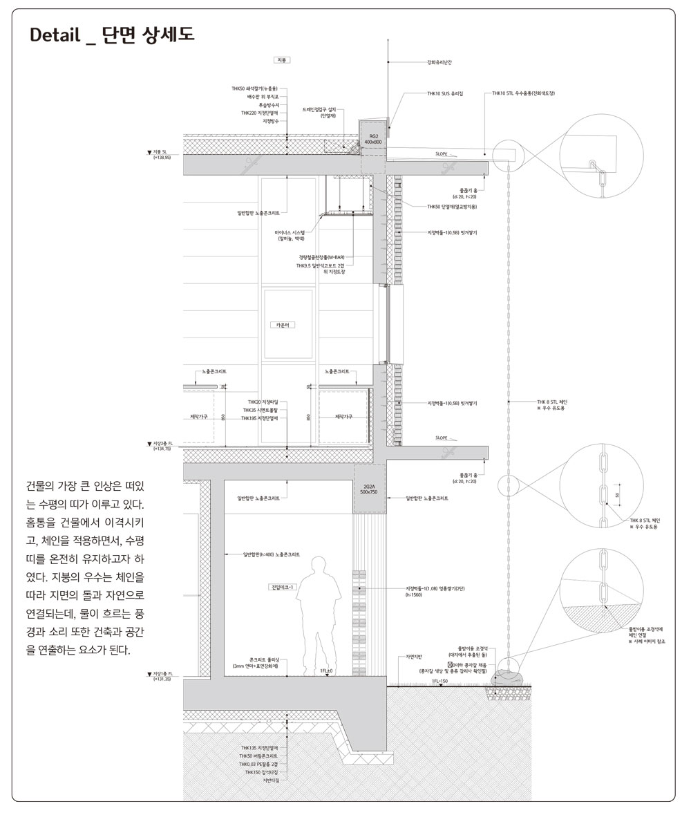
건물을 구성하는 외관은 단순하다. 2개의 수평 띠 사이에 벽돌로 채우고 이를 떠있게 만들었는데, 수평 띠는 2층의 바닥, 천장의 연장으로 보이고자 하였다. 2층의 바닥은 일반적인 기둥보의 구조를 따랐지만, 2층의 천장구조물은 역보로 계획하여 천장면이 그대로 외부로 확장된다. 두개의 띠는 절제된 디자인의 틀과 같다. 그 사이를 어두운 톤의 벽돌로 다양한 방식으로 쌓았고, 다채로운 그림자의 패턴이 생기도록 하였다.
질서정연한 콘크리트 바탕
노출 콘크리트의 거푸집은 일반합판으로 하되, 한 장(2.4㎜×1.2m)을 3등분하여 사용하였다. 0.4미터의 간격으로 생긴 수평선은 모든 높이와 관련된 치수(창·문·테이블)를 정의한다. 0.4미터 높이의 벤치와 1.6미터의 가벽, 그리고 4미터 높이의 내부 벽체는 정갈한 수평선의 반복 속에 있다. 좁아진 수평선은 거대한 덩어리의 콘크리트 느낌에서 벗어나 마치 쌓아올린 구조물과 같은 느낌이 들게 하였고, 보다 정밀하고 세심한 느낌을 준다. 질서정연한 콘크리트 면을 바탕으로 산의 풍경을 담았다.
The site is about 3 meters lower than its surrounding area, and since too many restaurants surround it, it is less recognizable. The only positive here is that a stream flows east of the site with a mountain at the back, although a power transmission tower stands at the top of the mountain, and part of the mountain has been damaged by the developer. When you enter the piloti space on the first floor, a massive door made of HR steel covers a part of the courtyard and shows it through the gaps. It is called ‘hidden nature’ from this space to the garden. The courtyard is made of birch trees, stones and moss, adding light and shadow, creating a dramatic atmosphere. The piloti space made of exposed concrete can be dry and bleak, but the green, which is appropriately covered and seen through gaps, shines more brightly, providing a unique experience.
Architectural solution
The victory or defeat of commercial architecture, especially cafes, lies in the atmosphere of the space. As an architectural solution, firstly, the cafe was raised to create a huge outdoor space with pilotis on the first floor. It is a space where you can enjoy nature connected with the garden on the site. Second, the disordered landscape was organized with temporary walls and extended slabs. The temporary walls serve as a means to arouse curiosity about the space behind them by properly covering an opening rather than covering everything. Lastly, the most basic and honest material, concrete, was used as the main finishing material to create a building that forms the backdrop. Even the green, moderately covered by the exposed concrete, shines despite dry materiality.
Floating horizontal strips
The exterior of the building is simple. Bricks were filled between two horizontal strips and made to float. The horizontal strips represent an extension of the floor and the second floor's ceiling. The second floor follows the structure of general columns and beams, but the ceiling structure on the second floor is planned as upper beams so that the ceiling surface is extended to the outside as it is. The two strips are like a frame of understated design. Dark-toned bricks were stacked between them in various ways, creating a pattern of colorful shadows.
An orderly concrete base
The formwork for exposed concrete was made of typical plywood, but one sheet (2.4mm×1.2m) was divided into three equal parts. Horizontal lines at 0.4m intervals define all height-related dimensions (windows, doors, tables). The 0.4-meter-high bench, the 1.6-meter temporary walls, and the 4-meter-high interior walls are a repetition of neat horizontal lines. The narrowed horizontal lines break away from the feeling of a vast concrete mass and make it look like a structure as if piled up, giving it a more precise and detailed sense. The view of mountains was captured based on the orderly concrete surface.


| 포옥 설계자 | 김상언 · 김은진 _ 에스엔건축사사무소 건축주 | 이선자, 이윤성 감리자 | 김상언 _ 에스엔건축사사무소 시공사 | 태연디앤에프건설(주) 설계팀 | 김진영 대지위치 | 경기도 포천시 소흘읍 죽엽산로 685-20 주요용도 | 제1종 근린생활시설 대지면적 | 1,431.00㎡ 건축면적 | 349.39㎡ 연면적 | 377.52㎡ 건폐율 | 24.42% 용적률 | 26.38% 규모 | 2F 구조 | 철근콘크리트구조 외부마감재 | 노출콘크리트, 콘크리트벽돌(두라스텍 S340, 퓨어그레이, 탱고래드) 내부마감재 | 노출콘크리트, VP도장, 자작나무합판, 타일 설계기간 | 2018. 06 - 2020. 04 공사기간 | 2020. 05 - 2021. 05 사진 | 김용순 구조분야 : (주)이든구조건설턴트 기계설비분야 : (주)진원엔지니어링 전기분야 : (주)진원엔지니어링 소방분야 : (주)진원엔지니어링 |
Po.oak Architect | Kim, Sangeun · Kim, Eunjin _ SN Architecture Client | Lee, Sunja / Lee Younsung Supervisor | Kim, Sangeun _ SN Architecture Construction | Taeyoun D&F Architect Project team | Kim Jinyoung Location | 685-20, Jugyeopsan-ro, Soheul-eup, Pocheon-si, Gyeonggi-do, Korea Program | Neighborhood living facility Site area | 1,431.00㎡ Building area | 349.39㎡ Gross floor area | 377.52㎡ Building to land ratio | 24.42% Floor area ratio | 26.38% Building scope | 2F Structure | RC Exterior finishing | Exposed concrete, Concrete brick Interior finishing | Exposed concrete, VP Paint, Plywood(Birch), Tile Design period | 2018. 06 - 2020. 04 Construction period | 2020. 05 - 2021. 05 Photograph | Kim, Youngsoon Structural engineer | Eden Structural Consultant Mechanical engineer | JINWON ENGENEERING. Co., Ltd. Electrical engineer | JINWON ENGENEERING. Co., Ltd. Fire engineer | JINWON ENGENEERING. Co., Ltd. |